the problem.
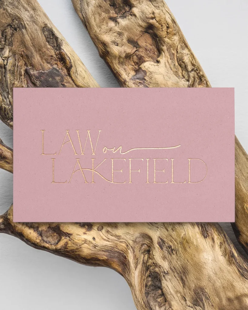
Stepping out on her own for the first time, Kayla needed a brand that felt distinctly hers - feminine and warm without being too soft, and credible enough to command trust in a competitive field. She was drawn to pink but unsure how far to take it, and needed everything from her logo to her website to work hard from day one.
our solution.
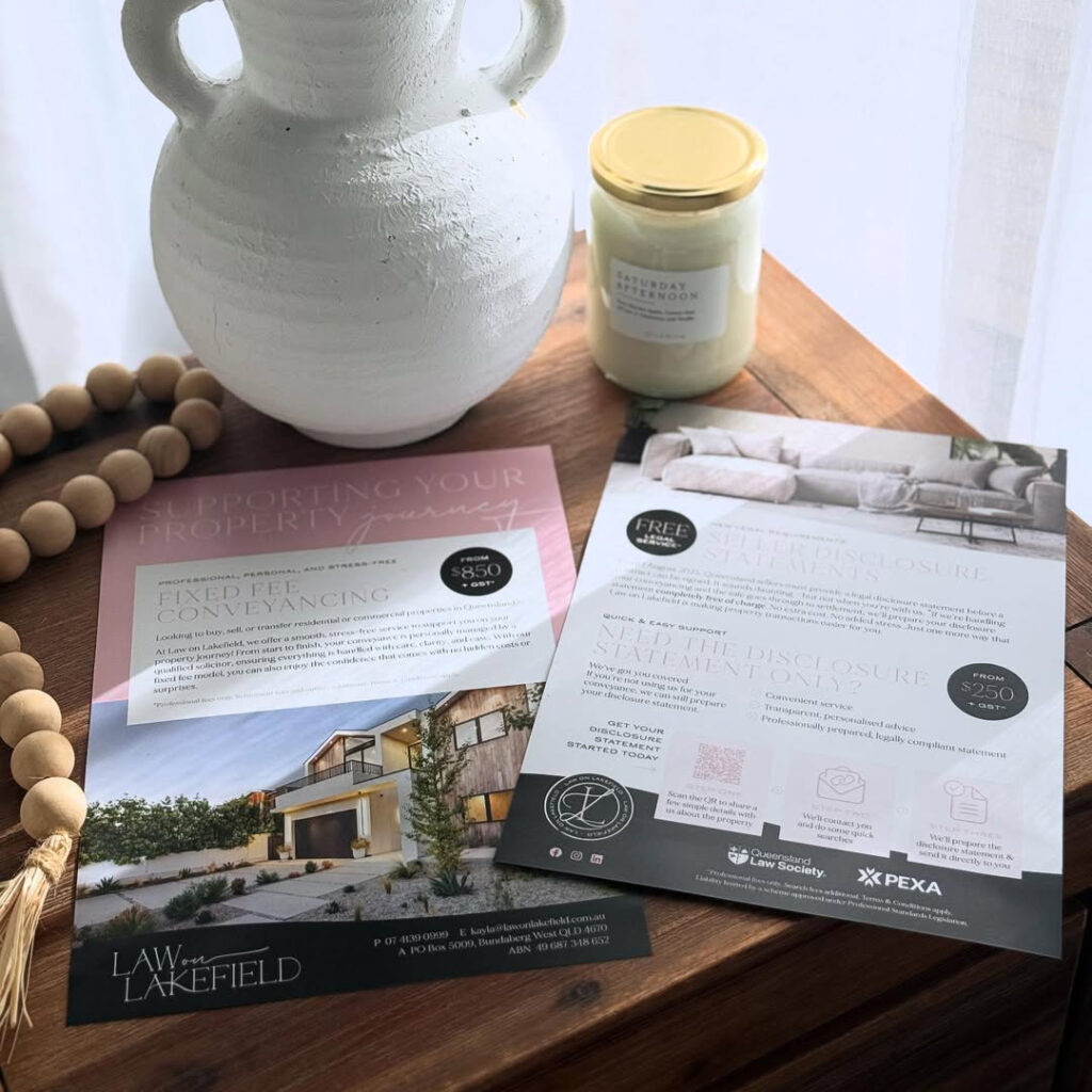
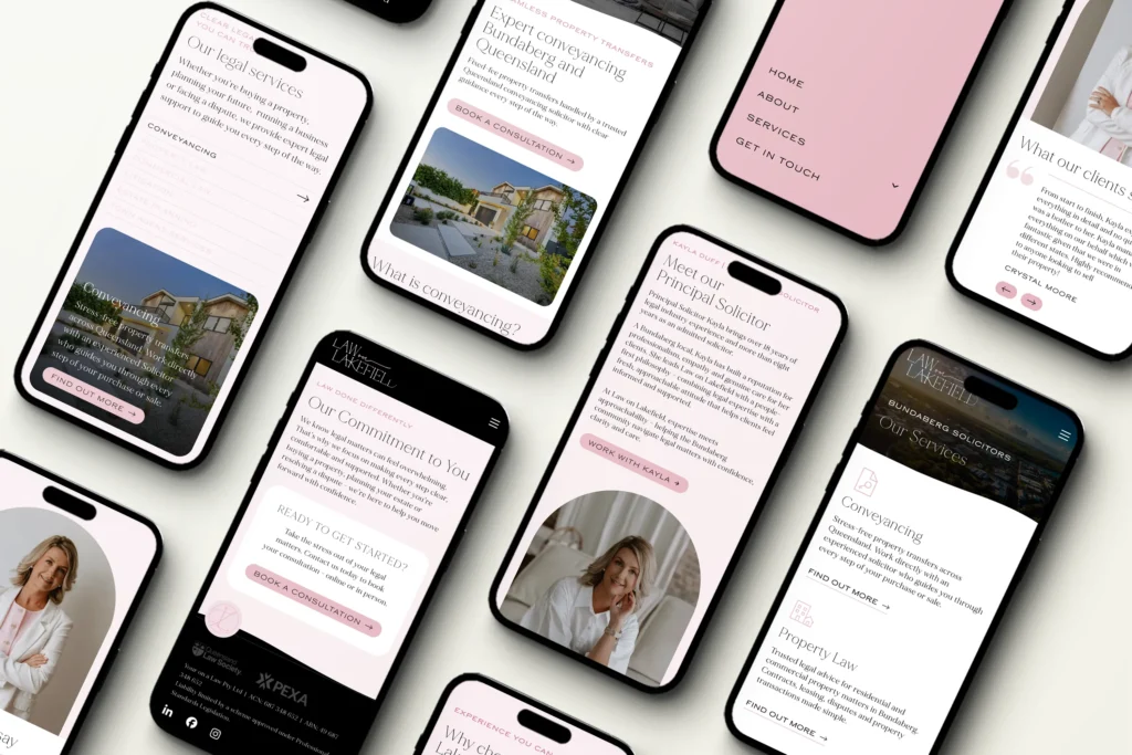
We built a strong black and white brand foundation that lets soft pink accents do the talking - striking the perfect balance between strength and femininity. Custom typeface modifications and a handwritten script created a logo that feels personal and polished. The website pairs SEO-driven copywriting with frictionless contact pathways, while Canva templates set her up to show up consistently on social media.
Completed
Platform
WordPress
services
Brand identity
Brand guidelines
Stationery
Web design
Copywriting
The Team
Branding & design: Dana Maggacis
Copywriting & strategy: Emma Eaton
Frontend development: Dana Maggacis