GWCoM
A bold new brand identity for the Greater Whitsunday Council of Mayors - uniting three regions under a singular, confident visual identity that communicates advocacy and far-reaching impact across Queensland and afar.
the problem.
GWCoM needed a modern brand that captured their collective purpose and the significant impact they have across Queensland and Australia. Early concepts tried to represent their three member regions visually, but the approach was creating fragmentation rather than strength - and wasn't landing with the clarity or confidence the organisation deserved.
our solution.
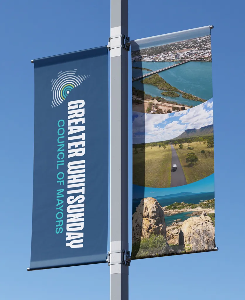
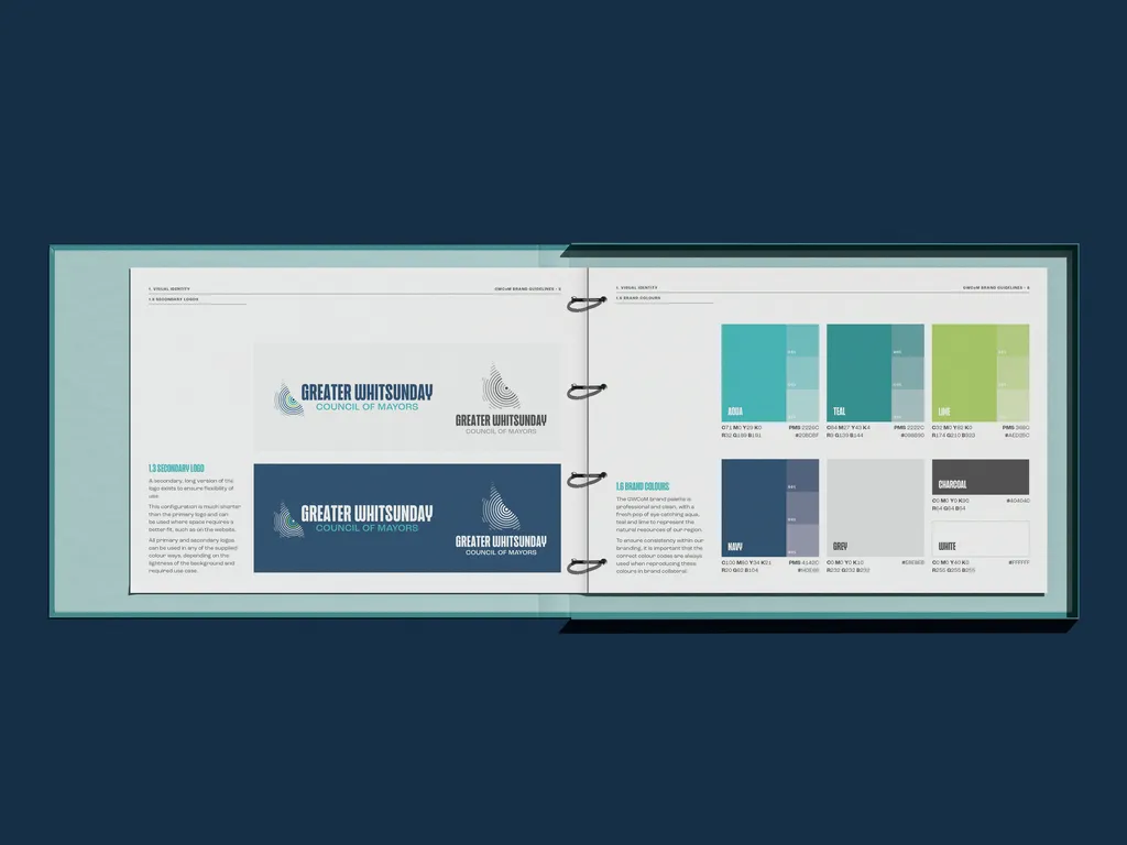
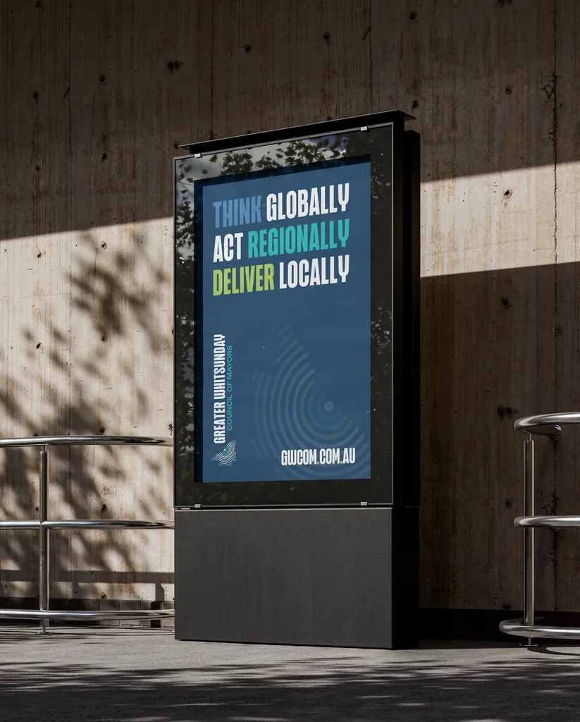
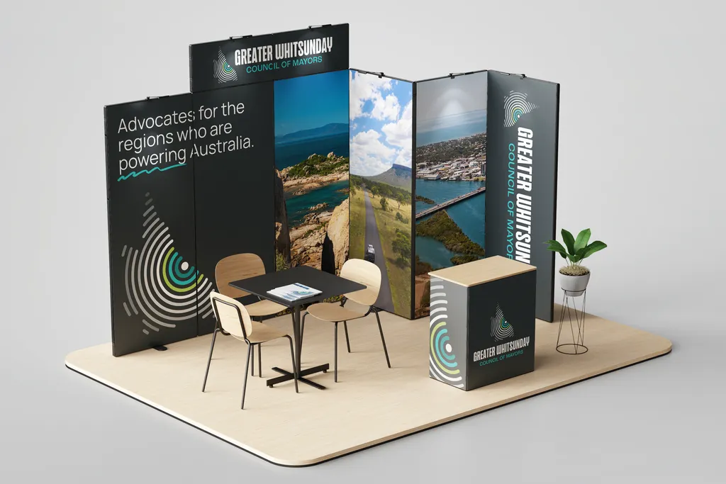
We guided GWCoM away from the three-regions concept and toward a united front - a single, powerful icon depicting a ripple effect spreading across Queensland from the Greater Whitsunday region, symbolising their advocacy and influence. Paired with a vibrant colour palette and modern typography, the result is a forward-carrying identity built for impact.
Completed
2025
services
Brand identity
Brand guidelines
Stationery
Website