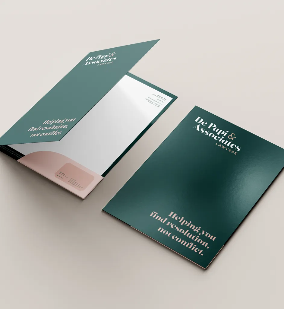
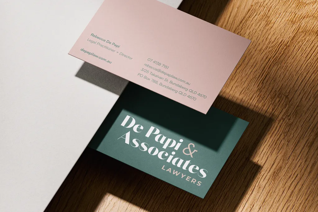
De Papi and Associates
A sophisticated yet modern brand identity for a local lawyer - blending a custom typeface logo with a refined pink and green palette that's authentically true to her brand.
the problem.
Rebecca felt her existing brand simply didn't represent her - it didn't reflect her personality, her approach, or the calibre of her work. She was drawn to green and pink but needed guidance on how to bring them together in a way that felt professional and polished rather than playful, and distinctly hers rather than generic.
our solution.
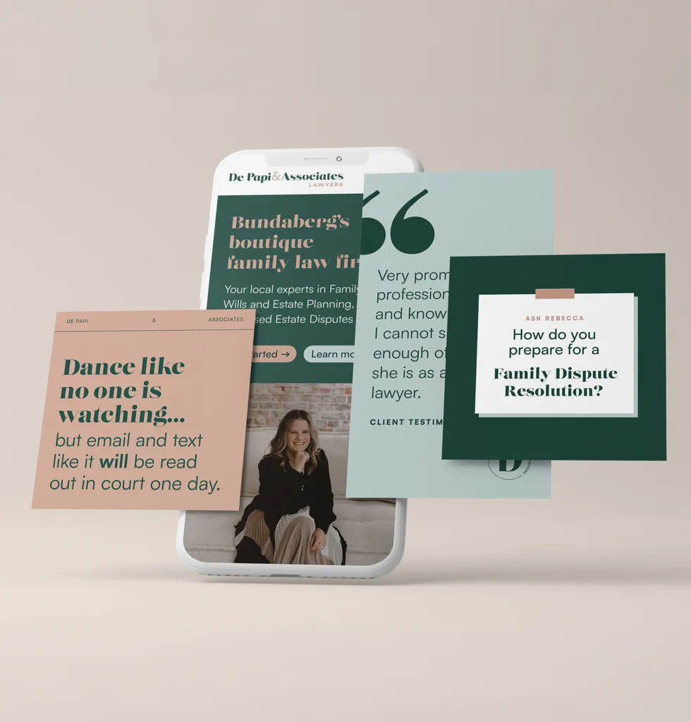
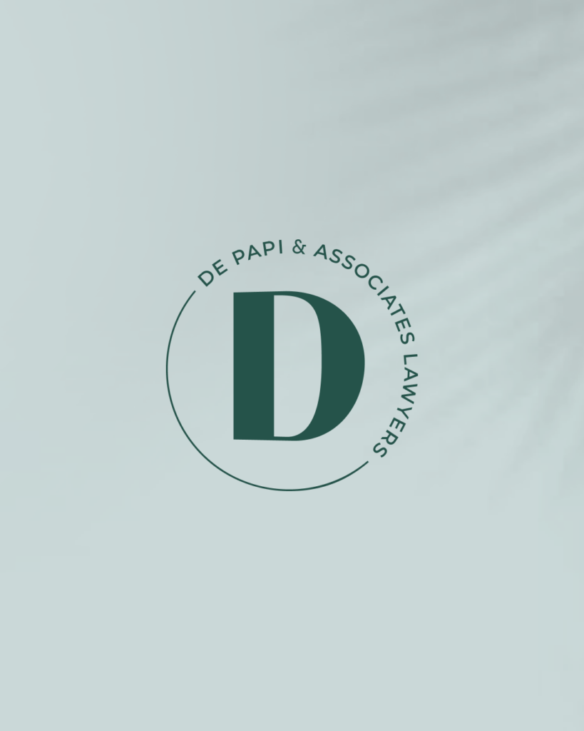
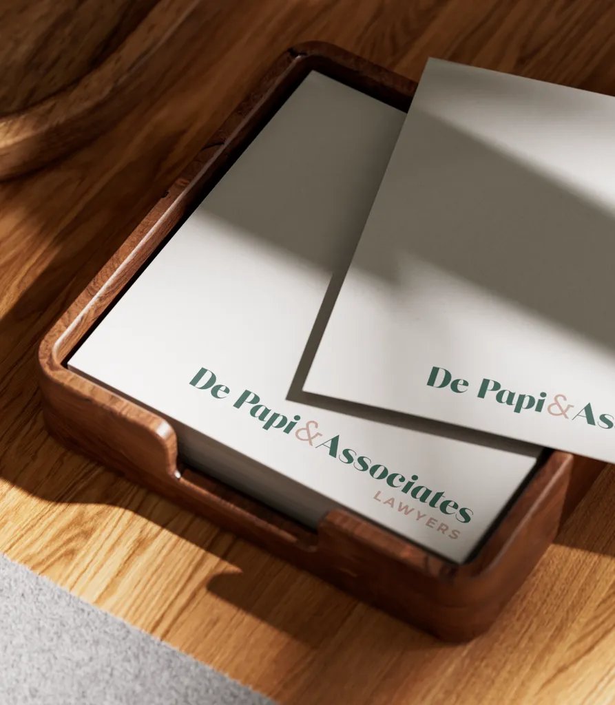
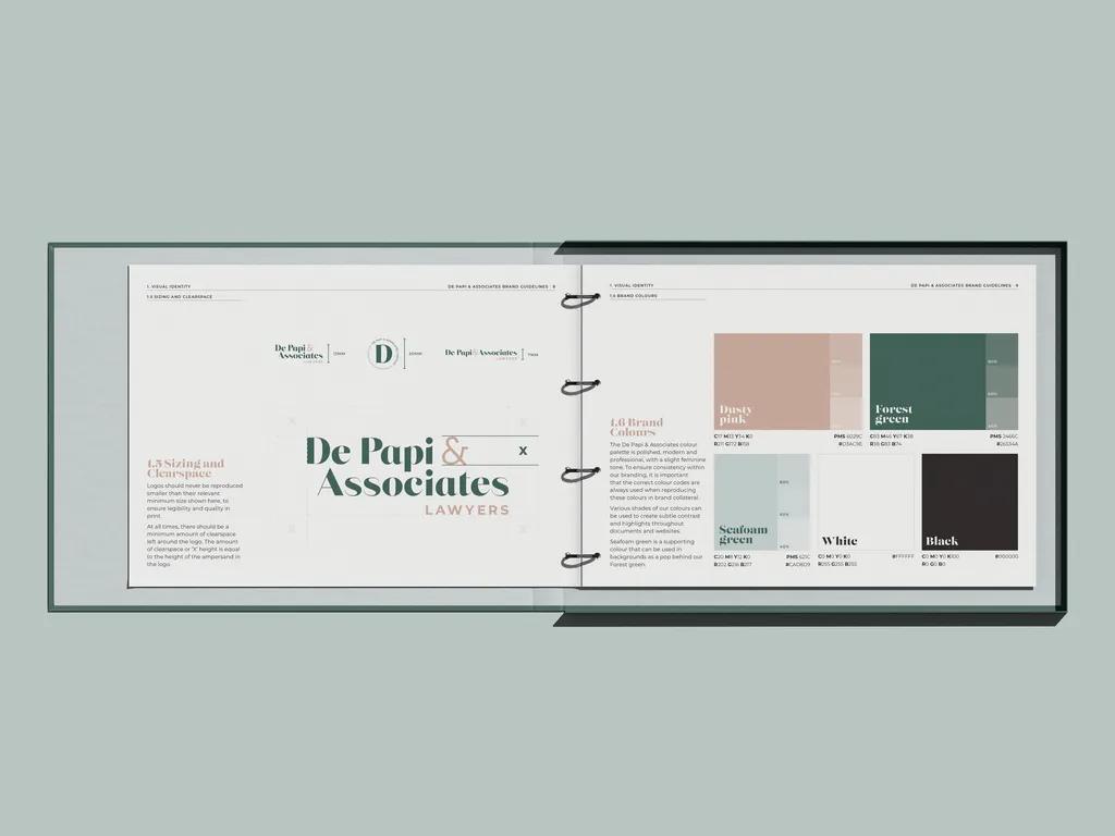
We developed a confident brand rooted in a didone serif typeface - a nod to the sophistication of the legal field - that we customised to remove the serifs and paired a clean sans-serif supporting font as a nod to her modern approach. Brought together with a carefully curated pink and green palette, where the tones were deliberately chosen to feel refined over vibrant, creating a simple yet commanding identity that is unmistakably De Papi and Associates.
Completed
services
Brand identity
Brand guidelines
Stationery
Social media templates